
Project
Generate an identity system for YRUU Pacific, a nonprofit organization that runs youth-led leadership development programming.
The YRUU Pacific brand is characterized by a convergence of youthful energy, Unitarian Universalism, and spirituality.
Strategy
On a functional level, the YRUUP identity was designed to be modifiable, allowing the client to change the tagline as appropriate for the application. The mark can also be abbreviated to an icon for small-format usage.
Soft but energetic colors associated with youth and wisdom support YRUUP’s brand message while a horizontal orientation creates a feeling of stability. Clean, simple design adds an air of professionalism, while curves and thick lines add an open, friendly feeling and a slight slant creates movement and energy. The chalice and tagline tie the logotype into spirituality and Unitarian Universalism, resulting in an identity mark which hits on all points of the YRUUP brand.
Process
![]()
Early iterations aimed for stability through use of a rounded rectangle.
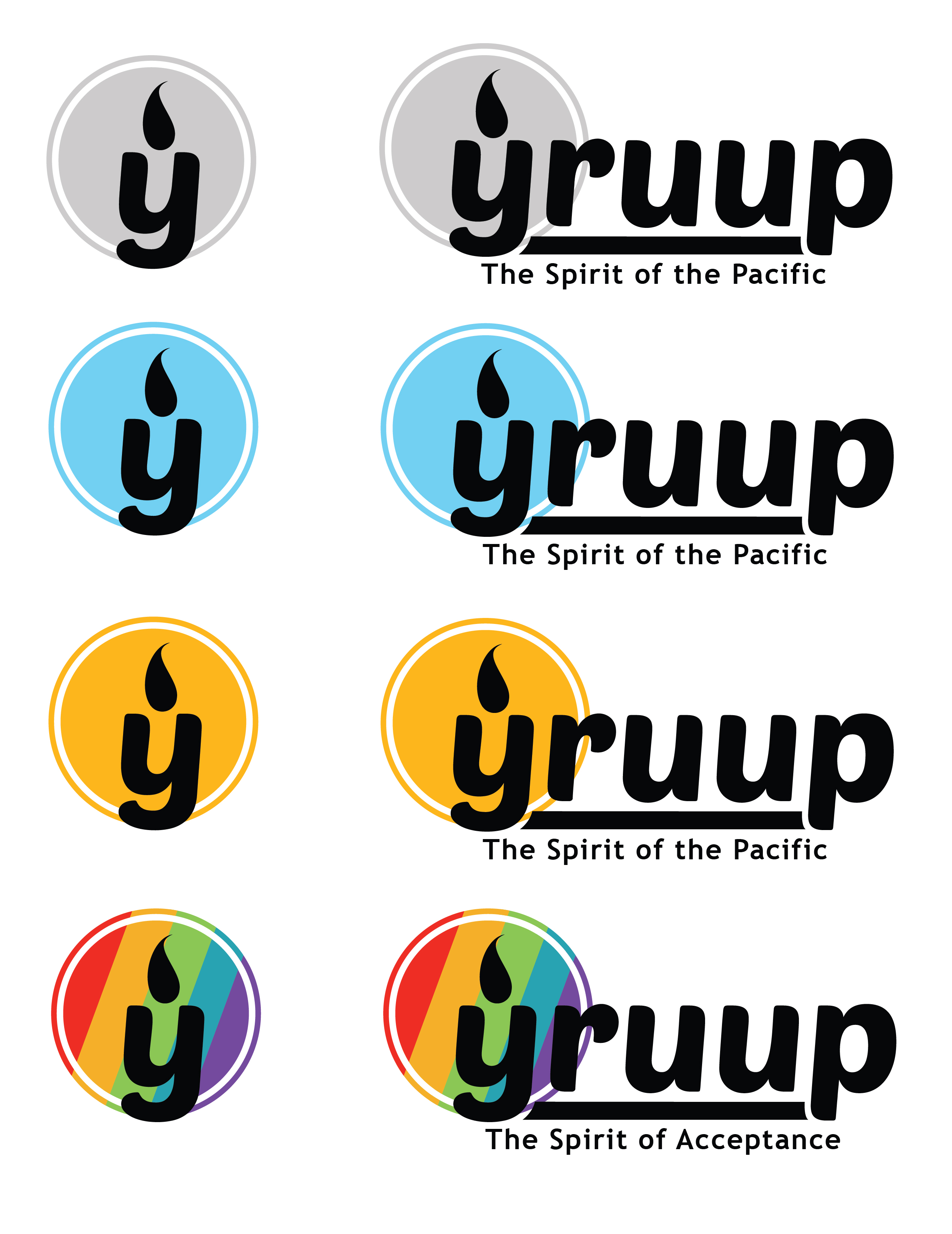
The design was further refined, playing on a motif of sunshine and light while improving the color choices and the mark’s modularity.
Website
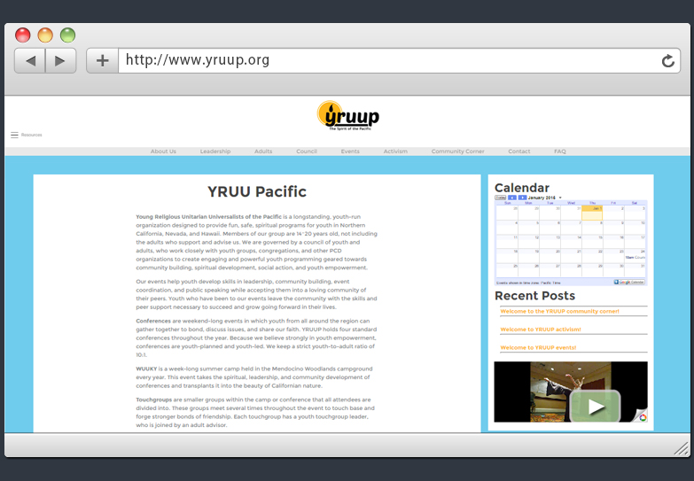
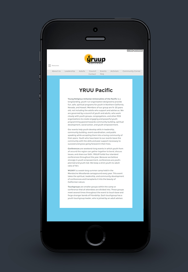
Branding was then applied to a basic website built on the tumblr platform for integrated social connection with YRUUP’s stakeholders.