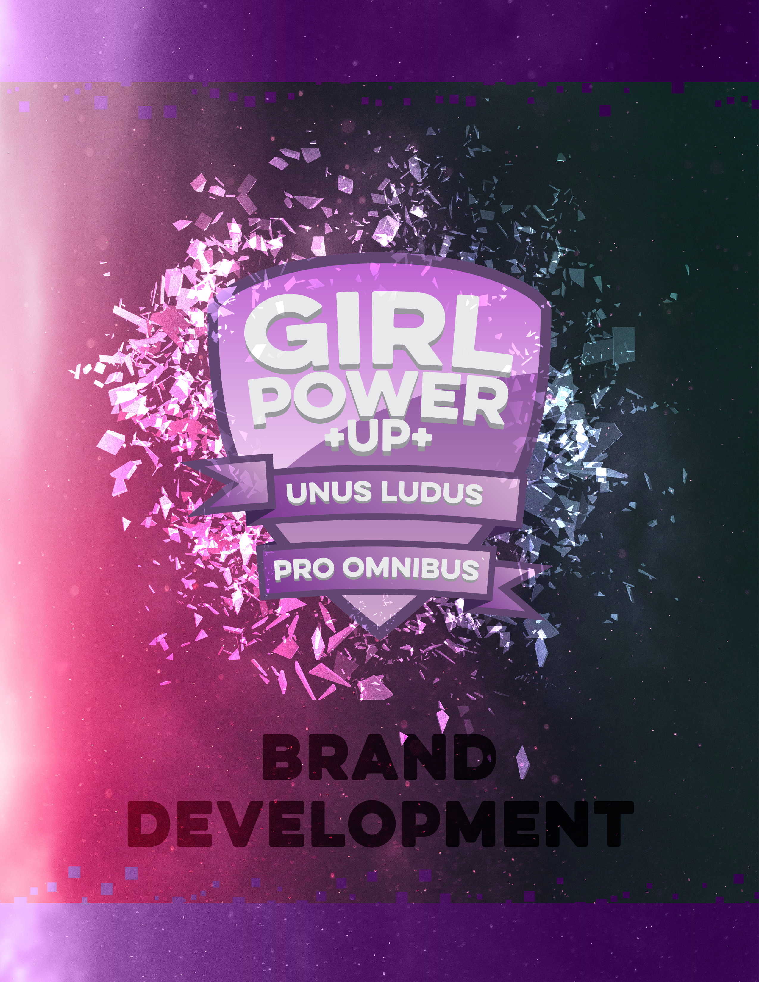
Project
This logotype was generated as part of a brand- and concept-development project centered around a fictional nonprofit. The brand was built from the ground-up, including development of the organization’s name, mission statement, and programming.
Mission
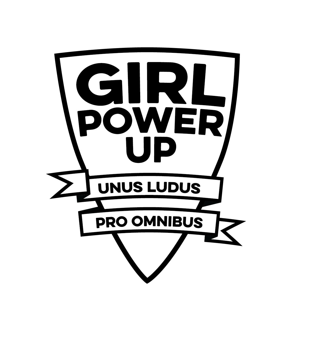
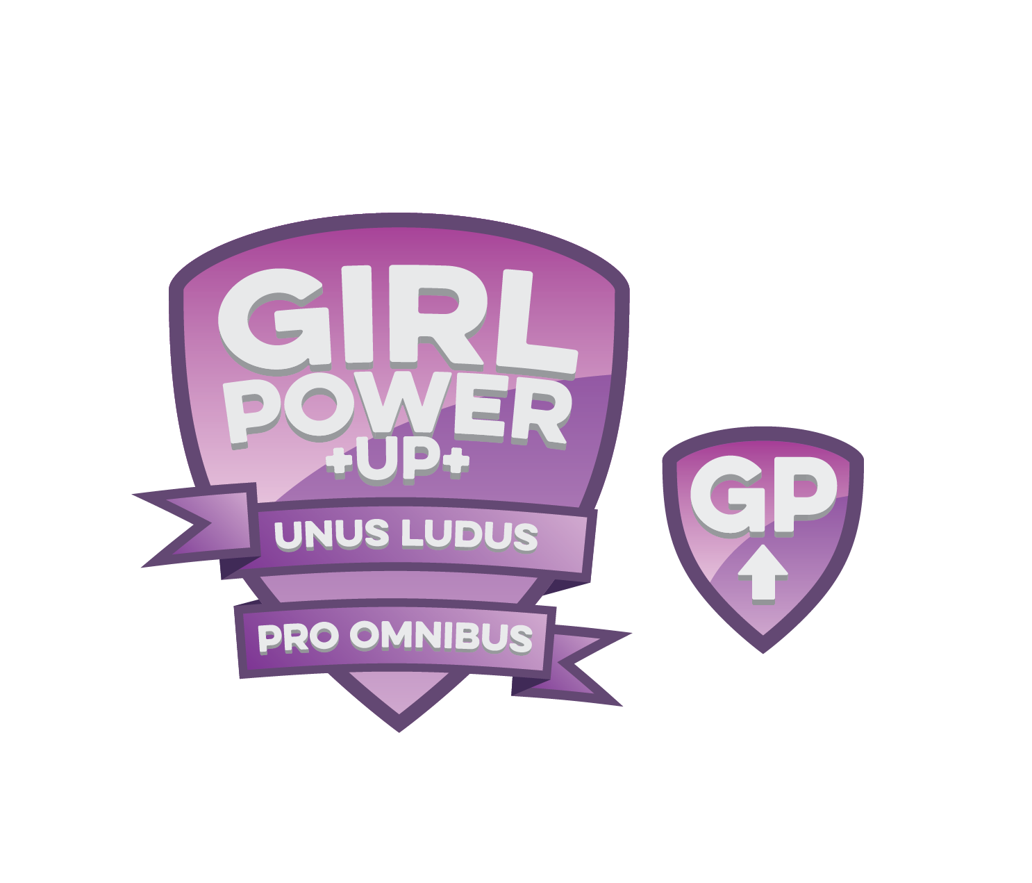
Girl Power Up was created due to widespread sexism in the gaming community. We are dedicated to creating a safe space for women gamers, and working to promote equality in esports.
Brand
Typography
The typeface used in the logo is Eveleth Clean Regular. The typeface was chosen for its bold stroke weight and its geometric strength partnered with soft, rounded corners to convey empowerment and institutional confidence without the aggression or masculinity often associated with more sharply geometric forms. The Girl Power Up brand uses Eveleth Clean Regular and Eveleth Clean Thin as header fonts, and the Open Sans typeface for body copy.
Primary Palette
The Girl Power Up brand utilizes colors that are easily recognized as feminine, while the darker value projects strength and authority.
The palettes used by Girl Power Up are divided into a stroke color, two gradient colors, and the GPU standard white.
Stroke
CMYK: 68, 80, 30, 13
RGB: 99, 71, 115
Hex: #634773
Gradient 1
CMYK: 62, 96, 0, 0
RGB: 124, 51, 147
Hex: #7C3393
Gradient 2
CMYK: 14, 34, 0, 0
RGB: 212, 173, 209
Hex: #D4ADD1
Standard white
CMYK: 8, 5, 5, 0
RGB: 232, 233, 234
Hex: #E8E9EA
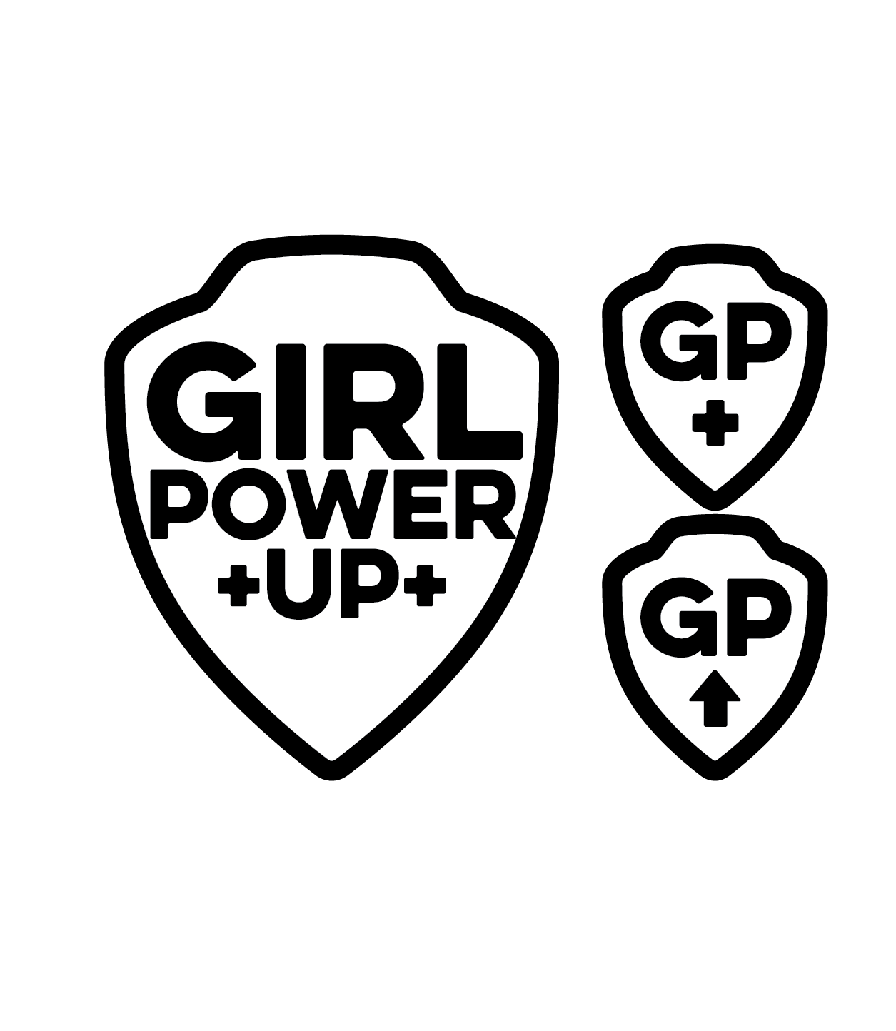
Logo Development
Initial Explorations
Concept Refinement
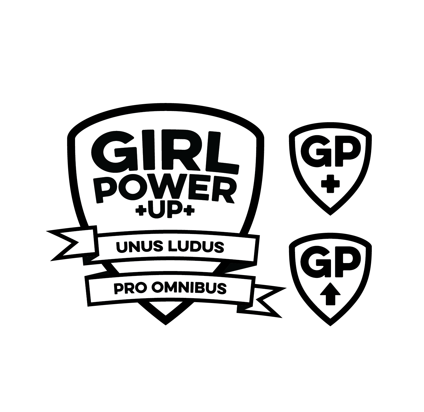
Final and Color
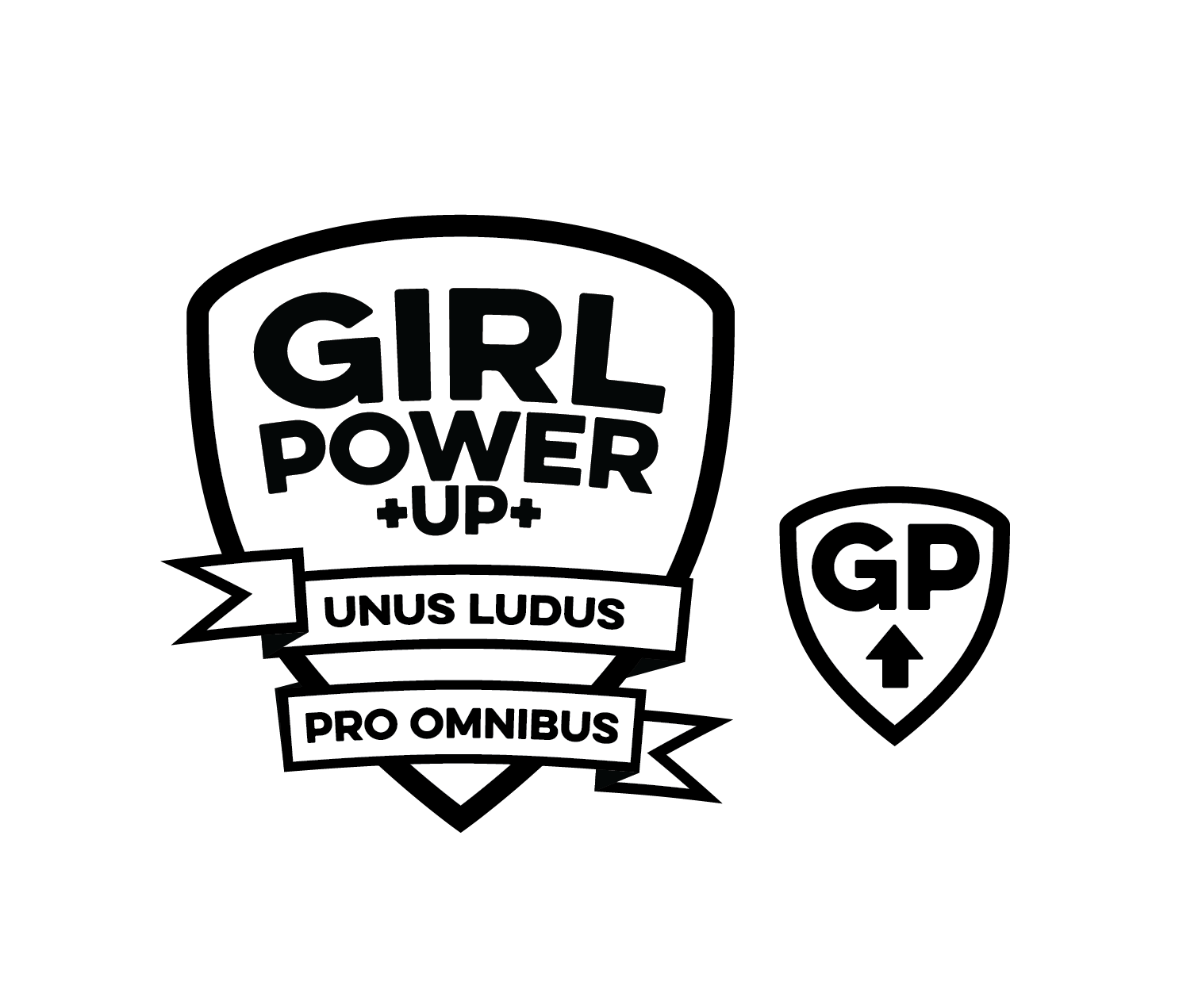
Alternate Designs
Each gaming league within the Girl Power Up organization has a unique color palette to set it apart from the broader brand and facilitate ease of use for gamers with various interests.

Sample Collateral
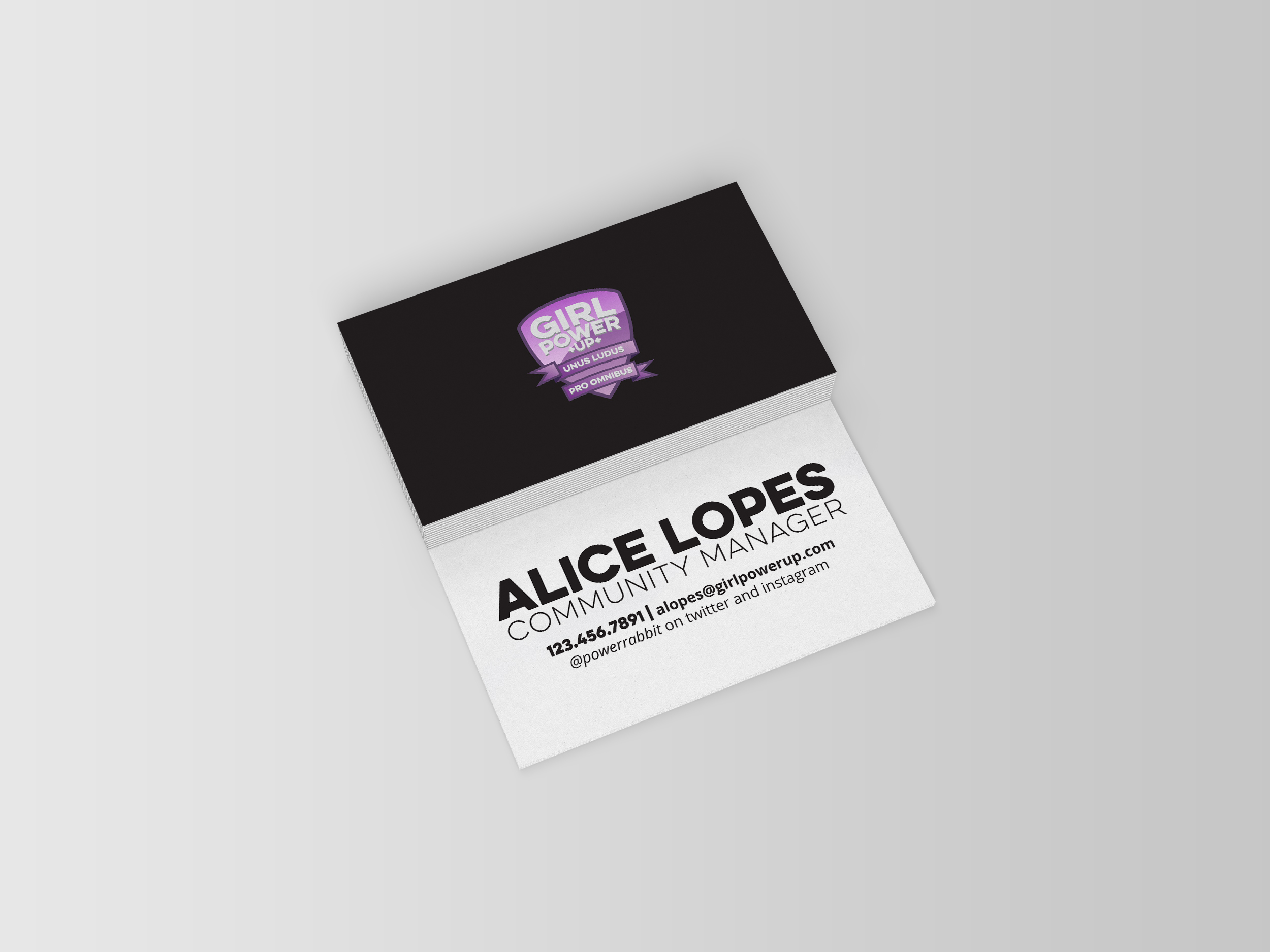
Business Cards
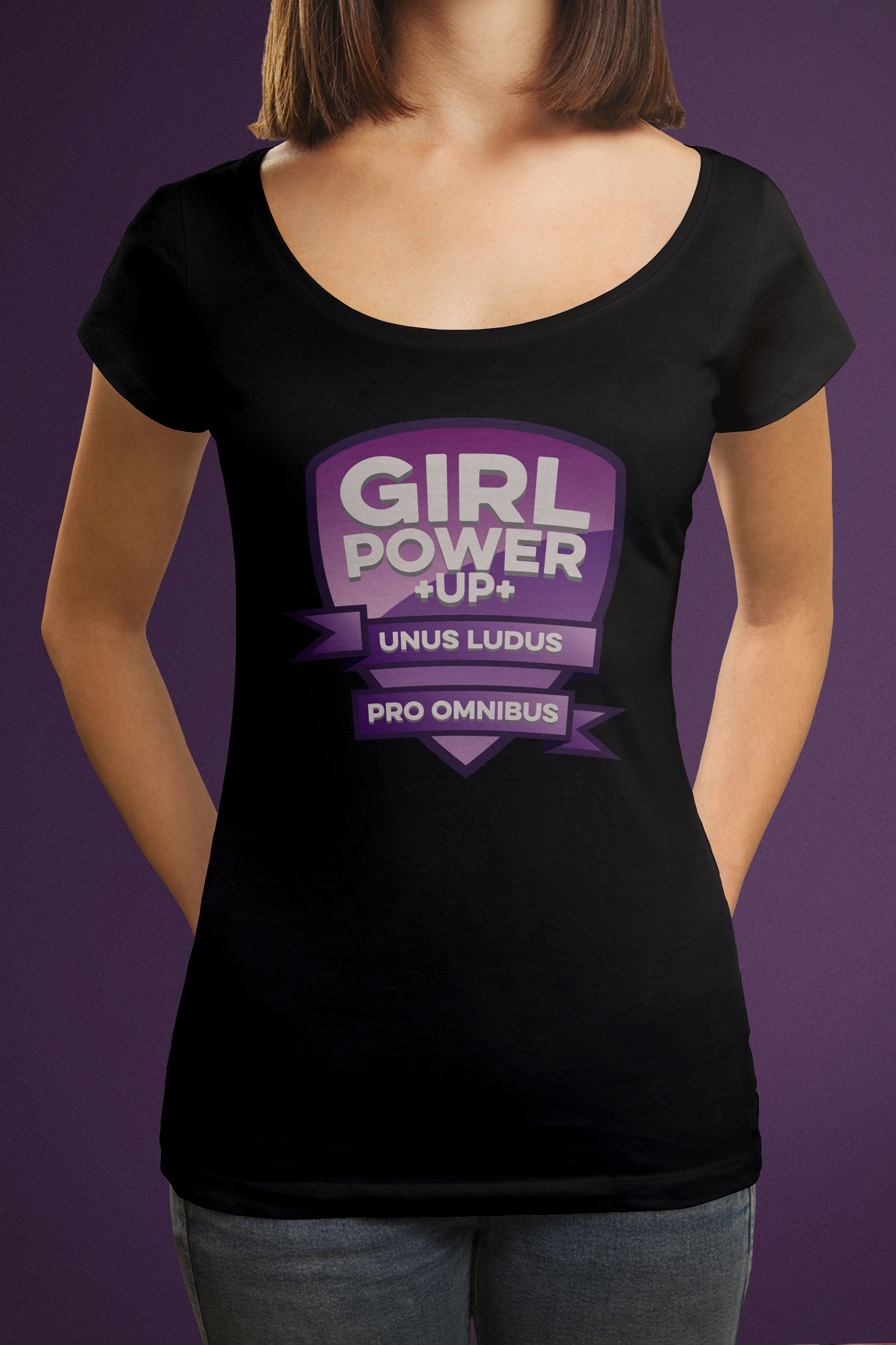
T-shirts